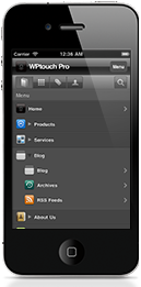
Important that your website is accessible on the iPhone
 With about 82 million Smartphone users in the US, and another 8 million in
Canada and the apple iphone accounting for approx 23% of this market its
important that your website is accessible to this new mobile workforce,
therefore we have assembled a list of online resources to assist you in
checking how your website displays on the iphone.
It is a free service by W3C that helps check the level of mobile-friendliness of Web documents, and in particular assert whether a Web document ismobileOK. To understand why checking a Web document for mobile-friendliness really matters, it is probably worth emphasizing a few points about the so-called mobile world. Compared to a regular desktop computer, a mobile device may be regarded as limited at first glance: smaller screen size, smaller processing powers, smaller amount of memory, no mouse, and so on
It is a service of dotMobi and an extension of W3C MobileOk Checker ServicThe mobiReady testing tool evaluates mobile-readiness using industrybest practices & standards. The free report provides both a score (from 1 to 5) and in-depth analysis of pages to determine how well your site performs on a mobile device.
A simple tool that shows what a website looks like once Google has made the web page mobile friendly. Go to the Mobile Testing site, to check the website in mobile format and you can confirm whether it is showing up correctly or not.
An iPad emulator although it will show flash even though flash is not going to work on an iPad.You may visit the site to know how your website looks in iPad
This is a web browser based simulator for quickly testing your iPhone web applications. This tool has been so far tested and working using Internet Explorer 7, FireFox 2 and Safari 3.
Find out withGomez’s Cross-Device Website Compatibility Test and:Identify browser problems that impact your end-users. Ensure device compatibility issues do not result in lost revenue and brand equity. See how your website renders across four real mobile devices iPhone 3Gs, iPad, BlackBerry Storm 2, and Google Nexus One.
Powered by MicroEmulator, a pure Java implementation of Java 2 Micro Edition in Java 2 Standard Edition licensed underLGPL. By default, the Opera Mobile 10 emulator will start in touchscreen mode at a resolution of 480×800 (the most common portrait WVGA screen size on modern smartphones). The size and input mode can be changed by starting the application from the command-line, using various configuration options.


