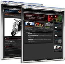
Website design and construction is one of the core 
business activities that can make or break your business.
A well-designed website will always attract more
visitors with greater revenue potential.
On the other hand, poor website construction can ruin
all your efforts of promoting your business online.
It can put your business reputation at stake and spoil all your
future business prospects if you neglect this important aspect.
Top 5 mistakes to avoid in website construction
- Bad colour schemes
One of the most important things to avoid in website construction
is to have a bad combination of colour schemes and background
which can be simply distracting to the users.
Never use too loud and dark colours that feel like screaming at the
visitors and creates confusion in their minds.
It is preferable to have dark coloured text with a light background
for creating a better visual effect with your website design
- Poor quality content
It is a really a big turn-off to have a content that is so difficult to read and understand with lack of clarity.
If the sentences are clubbed together and paragraphs are too long, then it can easily drive away your visitors.
Instead, create a content which carries more useful information for the visitors in an interactive manner.
Make it more readable and keep the sentences short so that it is easy for them to read and follow.
- Spelling mistakes and grammatical errors
It is necessary to avoid bad spelling mistakes and punctuation errors in your website construction.
It leaves a bad impression on the minds of the visitor and reflects carelessness on your part for
overlooking such minute details which can make a lot of difference to your business.
Always spell-check the entire content and if you find any grammatical mistakes or
punctuation errors, make sure you correct them accordingly during website construction.
- Badly designed layout
It is definitely annoying to find a website that is filled with so much of unnecessary
details leaving little space for the user to breathe!
In other words, it is sure to cause lot of distraction to the user while trying to
digest too much of available information.
Never go overboard with website construction by designing pages
that have no spaces left between the text and the graphics.
- Poor navigation facilities
The main aim of website development is to provide easy search
and navigation facilities to the visitor while browning your website.
But what is the use if this purpose gets defeated with lot of error pages, too many
broken links and ads repeatedly popping up in between?
The visitor is sure to lose his patience and get distracted by these things and go on to some other site.
If you do not want this to happen, then you need to pay attention to website construction
with good and easy navigation facilities Also, keep a check on the links
to see that they work with regular maintenance.
Thanks the Techstore Team


